<!DOCTYPE html>
<html style="height: 100% !important; width: 100% !important; font-family: 'Helvetica Neue', Helvetica, system-ui, -apple-system, Arial, sans-serif; font-weight: 400; font-style: normal; line-height: 1.5; font-size: 16px; overflow-wrap: break-word; word-wrap: break-word; word-spacing: normal; -ms-text-size-adjust: 100%; -webkit-text-size-adjust: 100%; margin: 0 auto; padding: 0;">
<head>
<meta http-equiv="content-type" content="text/html; charset=utf-8">
<meta name="viewport" content="width=device-width, initial-scale=1.0">
<meta name="color-scheme" content="light">
<meta name="supported-color-schemes" content="light">
<meta http-equiv="X-UA-Compatible" content="IE=edge">
<meta name="format-detection" content="telephone=no, date=no, address=no, email=no, url=no">
<!-- fixes email not full width ios gmail -->
<meta name="x-apple-disable-message-reformatting">
<title></title>
<!-- Theme-Name: shopify --><!-- Theme-Version: 1.18 -->
<!-- Outlook font fallback -->
<!--[if mso]>
<style>
* {
font-family:sans-serif !important;
}
</style>
<![endif]-->
<style type="text/css" data-shopify-email="" data-premailer="ignore"> /* Desktop column classes need to be on top of the one in the media query for mobile. */ .one-col .column { max-width: 100% !important; } .two-col .column { max-width: 50% !important; } .three-col .column { max-width: 33.3% !important; } .desktop-and-mobile-grid-padding { padding-top: 10px; } .desktop-and-mobile-grid-loose-padding { padding-top: 25px; } .single-column-grid-padding { padding-top: 20px; } .image--circle { border-radius: 600px; } .image--round { border-radius: 16px; } .desktop-hide { display: none !important; } .social-media__table { text-align: right; max-width: 160px; } .social-media__table--left { text-align: left; max-width: 100%; } .button-narrow { width: 260px; max-width:100%; } .button-wide { width: 400px; max-width:100%; } .button-fixed { width: 100% !important; max-width: 100% !important; } @media screen and (max-width:480px) { u~div .full-wrap { min-width:100vw; } div>u~div .full-wrap { min-width:100%; } .email-container { width:100% !important; margin:auto !important; } .column-container { padding-left:15px !important; padding-right:15px !important; } .stack-column { display:block !important; width:100% !important; max-width:100% !important; text-align:left !important; } .button-padding-full-width { padding-top: 0px !important; } .button-full-width { width:100% !important; text-align:center !important; margin-left:auto !important; margin-right:auto !important; float:none !important; } .button-narrow, .button-wide { width: auto !important; max-width: 100% !important; } .button-mobile-column { padding: 0 !important; } .mobile-hide { display:none !important; } .desktop-hide { display: block !important; } .social-icon { padding: 20px 12px 0 0 !important; } .image { width:100% !important; height:auto !important; } .one-col .column { max-width: 100% !important; } .two-col .column { max-width: 50% !important; } .two-col.wrap-mobile .column { max-width: 100% !important; } .mobile-column-padding { padding-top: 30px; } .three-col .column { max-width: 50% !important; } .mobile-grid-padding { padding-top: 10px; } .mobile-grid-loose-padding, .desktop-and-mobile-grid-loose-padding { padding-top: 30px; } .social-media__table { text-align: left; max-width: 100%; } .mobile-text-column-padding { padding-bottom: 16px; } } /* Work-around for email clients meddling in triggered links. */ a[x-apple-data-detectors], .unstyle-auto-detected-links a, .aBn { border-bottom: 0 !important; cursor: default !important; color: inherit !important; text-decoration: none !important; font-size: inherit !important; font-family: inherit !important; font-weight: inherit !important; line-height: inherit !important; } /* Prevents Gmail from changing the text color in conversation threads. */ .im { color: inherit !important; } /* Prevents Gmail from displaying a download button on large, non-linked images. */ .a6S { display: none !important; opacity: 0.01 !important; } /* Prevents GMail from overriding the color of links */ .ii a[href] { color: inherit; } .inheritLinkStyle a { color:inherit !important; text-decoration: none !important; } /* Center on Android 4.4 */ div[style*='margin:16px 0'] { margin: 0 !important; } .nav-menu-with-hover:hover { text-decoration: underline; } </style>
<style>body {
margin: 0 auto !important; padding: 0 !important; height: 100% !important; width: 100% !important; font-family: 'Helvetica Neue', Helvetica, system-ui, -apple-system, Arial, sans-serif; font-weight: 400; font-style: normal; line-height: 1.5; font-size: 16px; overflow-wrap: break-word; word-wrap: break-word; word-spacing: normal;
}
img {
-ms-interpolation-mode: bicubic;
}
img {
border: 0; height: auto; outline: none; text-decoration: none;
}
</style>
</head>
<body width="100%" style="background-color: #fff; height: 100% !important; width: 100% !important; font-family: 'Helvetica Neue', Helvetica, system-ui, -apple-system, Arial, sans-serif; font-weight: 400; font-style: normal; line-height: 1.5; font-size: 16px; overflow-wrap: break-word; word-wrap: break-word; word-spacing: normal; -ms-text-size-adjust: 100%; -webkit-text-size-adjust: 100%; margin: 0 auto; padding: 0;" class="full-wrap">
<table cellspacing="0" cellpadding="0" border="0" align="center" width="100%" style="background-color: #fff; -ms-text-size-adjust: 100%; -webkit-text-size-adjust: 100%; mso-table-lspace: 0pt !important; mso-table-rspace: 0pt !important; border-spacing: 0 !important; border-collapse: collapse !important; table-layout: fixed !important; margin: auto;" class="full-wrap">
<tbody>
<tr style="-ms-text-size-adjust: 100%; -webkit-text-size-adjust: 100%;">
<td style="-ms-text-size-adjust: 100%; -webkit-text-size-adjust: 100%; mso-table-lspace: 0pt !important; mso-table-rspace: 0pt !important; vertical-align: top;">
<!-- SHOPIFY // Logo Header -->
<table cellspacing="0" cellpadding="0" border="0" align="center" width="600" style="background-color: #fff; -ms-text-size-adjust: 100%; -webkit-text-size-adjust: 100%; mso-table-lspace: 0pt !important; mso-table-rspace: 0pt !important; border-spacing: 0 !important; border-collapse: collapse !important; table-layout: fixed !important; margin: auto;" class="email-container">
<tbody>
<tr style="-ms-text-size-adjust: 100%; -webkit-text-size-adjust: 100%;">
<td style="-ms-text-size-adjust: 100%; -webkit-text-size-adjust: 100%; mso-table-lspace: 0pt !important; mso-table-rspace: 0pt !important; vertical-align: top;">
<table cellspacing="0" cellpadding="0" border="0" align="center" width="600" style="background-color: #fff; color: #333333; -ms-text-size-adjust: 100%; -webkit-text-size-adjust: 100%; mso-table-lspace: 0pt !important; mso-table-rspace: 0pt !important; border-spacing: 0 !important; border-collapse: collapse !important; table-layout: fixed !important; margin: auto;" class="email-container">
<tbody>
<tr style="-ms-text-size-adjust: 100%; -webkit-text-size-adjust: 100%;">
<td style="font-size: 25px; line-height: 1.2; font-family: 'Helvetica Neue', Helvetica, Arial, sans-serif; font-weight: 400; font-style: normal; -ms-text-size-adjust: 100%; -webkit-text-size-adjust: 100%; mso-table-lspace: 0pt !important; mso-table-rspace: 0pt !important; vertical-align: top; padding: 25px 60px;" align="center" class="column-container">
<a href="https://www.hollehippos.eu/_t/c/A1020005-17CDBDBBD23BF1E9-56A541FA?l=AABX5ysD6mm9D%2BGh5hn3e83k%2FWHrRWuAFCLjwn141NI8ZqfjEziN%2BcDHxzqiJ7AyY2mrDS6JuPR3FgM3l9cGGpgI83geaa24Z1A04zcWtMS81AMyOgH62sMpR0MjI7%2BRD3C5XmxGkJw6IvG4Yd7zHVnGy%2FLpweFDDU0gXSETCKsF2fV%2BDfLQOpZtjvVtcVWTqFxblklpBJ3IfE%2Ffvij0IRumTQo2XqcppLJ4DW2YFEnFyeM94ZkX5ulvQQEiURZK7dEYekc%2BbkadHHZbhdfNNepAfLHQAA%3D%3D&c=AAA2ilpbJAjDPiNvMjU8sCf%2FnKUl56%2ByLijK4R5AjKFpvZBkvIixX0JRLDQPb6EB5WRm4wF%2B719QDedIadYXM3%2FlvOGxZje720iK%2B9OVDaau3zS2cOSBP4I6%2F9kd%2Ft3kivQUpu%2Fr86SIas0K%2FtutWC58Pnyfpcn6RkDMNLwEZdKBDYzSukZZUCA98DT7pfzwz6ZRYw%2F%2Fy7%2B0mEnt8glVkC2w%2FGCg9ItjQ6S7Qb7bxbiWoXfQM9n4iCqdAfd5M5xCySuxlFrj3E9JpccoifmIudD0lQw5xY4a%2BubWQrRLCyp7xcA7N1zVZ0zumDVRYnlQdC6j0O74fo8admipluVE9xu%2BhFSso%2B76T%2Fdi1XcisRruaA9LwhMTqwyBXCtVoqvQMCfq88FMxsaS9aQiZxJ00P%2FbJVIsAsSsMKLEK%2FP3g5kyL9UliPcW6XeLGGOAMDM6pVlgumnxn1TJu1dJDL8rnlp3di6KHqK6jWRCbmwuBq6vdXsBhIs6ZNevq1HhOk7nS9AlUnbw6NMvEuTiolq6PrrlRDaVYaAImj47S7WJ%2BB6ST5t9bdRefAn7tfSmDCrqvngEUEFR03Z%2Bner2MKhsEJDBnvOJSSYvswY1HyUh52W5HsRxG%2FZsGdLHQW2gq%2FIm0UoeH2WpFRFFislJdVyYQfYj" style="color: #333333; text-decoration: none; -ms-text-size-adjust: 100%; -webkit-text-size-adjust: 100%;" target="_blank">
<img src="https://cdn.shopify.com/shopify-email/2axakeu6x17rds7wvik4sx61r8h3.png?width=960&height=960" alt="HolleHiPPos" border="0" width="120" height="134" style="width: 120px; height: 134px; max-width: 100%; -ms-text-size-adjust: 100%; -webkit-text-size-adjust: 100%; -ms-interpolation-mode: bicubic; outline: none; text-decoration: none; border-width: 0;">
</a>
</td>
</tr>
</tbody>
</table>
</td>
</tr>
</tbody>
</table>
<table cellspacing="0" cellpadding="0" border="0" align="center" width="600" style="background-color: #fff; -ms-text-size-adjust: 100%; -webkit-text-size-adjust: 100%; mso-table-lspace: 0pt !important; mso-table-rspace: 0pt !important; border-spacing: 0 !important; border-collapse: collapse !important; table-layout: fixed !important; margin: auto;" class="email-container">
<tbody>
<tr style="-ms-text-size-adjust: 100%; -webkit-text-size-adjust: 100%;">
<td style="-ms-text-size-adjust: 100%; -webkit-text-size-adjust: 100%; mso-table-lspace: 0pt !important; mso-table-rspace: 0pt !important; vertical-align: top;">
<table cellspacing="0" cellpadding="0" border="0" align="center" width="600" style="background-color: #fff; -ms-text-size-adjust: 100%; -webkit-text-size-adjust: 100%; mso-table-lspace: 0pt !important; mso-table-rspace: 0pt !important; border-spacing: 0 !important; border-collapse: collapse !important; table-layout: fixed !important; margin: auto;" class="email-container">
<tbody>
<tr style="-ms-text-size-adjust: 100%; -webkit-text-size-adjust: 100%;">
<td width="600" border="0" align="center" class="" style="width: 100%; max-width: 600px; -ms-text-size-adjust: 100%; -webkit-text-size-adjust: 100%; mso-table-lspace: 0pt !important; mso-table-rspace: 0pt !important; vertical-align: top; padding: 0px;">
<a href="" target="_blank" style="-ms-text-size-adjust: 100%; -webkit-text-size-adjust: 100%; text-decoration: underline;">
<img src="https://cdn.shopify.com/shopify-email/rvzz88f6qmhvnj2bx1x5ryo95z9p.jpg?width=1200" class="image" align="center" border="0" width="600" height="597" style="width: 600px; height: 597px; -ms-text-size-adjust: 100%; -webkit-text-size-adjust: 100%; -ms-interpolation-mode: bicubic; outline: none; text-decoration: none; border-width: 0;">
</a>
</td>
</tr>
</tbody>
</table>
</td>
</tr>
</tbody>
</table>
<!-- SHOPIFY // Button -->
<table cellspacing="0" cellpadding="0" border="0" align="center" width="600" style="background-color: #fff; -ms-text-size-adjust: 100%; -webkit-text-size-adjust: 100%; mso-table-lspace: 0pt !important; mso-table-rspace: 0pt !important; border-spacing: 0 !important; border-collapse: collapse !important; table-layout: fixed !important; margin: auto;" class="email-container">
<tbody>
<tr style="-ms-text-size-adjust: 100%; -webkit-text-size-adjust: 100%;">
<td style="-ms-text-size-adjust: 100%; -webkit-text-size-adjust: 100%; mso-table-lspace: 0pt !important; mso-table-rspace: 0pt !important; vertical-align: top;">
<table cellspacing="0" cellpadding="0" border="0" align="center" width="600" style="background-color: #fff; -ms-text-size-adjust: 100%; -webkit-text-size-adjust: 100%; mso-table-lspace: 0pt !important; mso-table-rspace: 0pt !important; border-spacing: 0 !important; border-collapse: collapse !important; table-layout: fixed !important; margin: auto;" class="email-container">
<tbody>
<tr style="-ms-text-size-adjust: 100%; -webkit-text-size-adjust: 100%;">
<td style="-ms-text-size-adjust: 100%; -webkit-text-size-adjust: 100%; mso-table-lspace: 0pt !important; mso-table-rspace: 0pt !important; vertical-align: top; padding: 40px 60px;" align="center" class="column-container">
<table border="0" cellspacing="0" cellpadding="0" class="button-full-width" style="-ms-text-size-adjust: 100%; -webkit-text-size-adjust: 100%; mso-table-lspace: 0pt !important; mso-table-rspace: 0pt !important; border-spacing: 0 !important; border-collapse: collapse !important; table-layout: fixed !important;">
<tbody>
<tr style="-ms-text-size-adjust: 100%; -webkit-text-size-adjust: 100%;">
<td align="center" style="border-radius: 12px; background-color: #6c45a1; -ms-text-size-adjust: 100%; -webkit-text-size-adjust: 100%; mso-table-lspace: 0pt !important; mso-table-rspace: 0pt !important; vertical-align: top;">
<a class="button-with-rich-text " href="https://www.hollehippos.eu/_t/c/A1020005-17CDBDBBD23BF1E9-56A541FA?l=AADNGzKRED34pf87AuLXq%2Bh0Cm62rOnA5vpgk2DS8gvU%2BRSKtgImRv6KNkCipd%2FWNwNHa3i7hDnOon7aUTmY59xJnwrnaQNbm%2BQFOblAQQm%2Ft%2B3BR%2FlBsVBhTvnD7lCOw8ApRGlewDDIvNVYw9hszUQjtgb0S0%2F%2BCA%3D%3D&c=AAA2ilpbJAjDPiNvMjU8sCf%2FnKUl56%2ByLijK4R5AjKFpvZBkvIixX0JRLDQPb6EB5WRm4wF%2B719QDedIadYXM3%2FlvOGxZje720iK%2B9OVDaau3zS2cOSBP4I6%2F9kd%2Ft3kivQUpu%2Fr86SIas0K%2FtutWC58Pnyfpcn6RkDMNLwEZdKBDYzSukZZUCA98DT7pfzwz6ZRYw%2F%2Fy7%2B0mEnt8glVkC2w%2FGCg9ItjQ6S7Qb7bxbiWoXfQM9n4iCqdAfd5M5xCySuxlFrj3E9JpccoifmIudD0lQw5xY4a%2BubWQrRLCyp7xcA7N1zVZ0zumDVRYnlQdC6j0O74fo8admipluVE9xu%2BhFSso%2B76T%2Fdi1XcisRruaA9LwhMTqwyBXCtVoqvQMCfq88FMxsaS9aQiZxJ00P%2FbJVIsAsSsMKLEK%2FP3g5kyL9UliPcW6XeLGGOAMDM6pVlgumnxn1TJu1dJDL8rnlp3di6KHqK6jWRCbmwuBq6vdXsBhIs6ZNevq1HhOk7nS9AlUnbw6NMvEuTiolq6PrrlRDaVYaAImj47S7WJ%2BB6ST5t9bdRefAn7tfSmDCrqvngEUEFR03Z%2Bner2MKhsEJDBnvOJSSYvswY1HyUh52W5HsRxG%2FZsGdLHQW2gq%2FIm0UoeH2WpFRFFislJdVyYQfYj" target="_blank" style="text-decoration: none; border-radius: 12px; background-color: #6c45a1; display: block; min-width: 80px; color: #ffffff; font-size: 16px; font-family: 'Helvetica Neue', Helvetica, Arial, sans-serif; font-weight: 400; font-style: normal; word-break: break-word; -ms-text-size-adjust: 100%; -webkit-text-size-adjust: 100%; padding: 14px 28px; border: 3px solid #6c45a1;">
Shop Now!
</a>
</td>
</tr>
</tbody>
</table>
</td>
</tr>
</tbody>
</table>
</td>
</tr>
</tbody>
</table>
<table cellspacing="0" cellpadding="0" border="0" align="center" width="600" style="background-color: #fff; -ms-text-size-adjust: 100%; -webkit-text-size-adjust: 100%; mso-table-lspace: 0pt !important; mso-table-rspace: 0pt !important; border-spacing: 0 !important; border-collapse: collapse !important; table-layout: fixed !important; margin: auto;" class="email-container">
<tbody>
<tr style="-ms-text-size-adjust: 100%; -webkit-text-size-adjust: 100%;">
<td style="-ms-text-size-adjust: 100%; -webkit-text-size-adjust: 100%; mso-table-lspace: 0pt !important; mso-table-rspace: 0pt !important; vertical-align: top;">
<table cellspacing="0" cellpadding="0" border="0" align="center" width="600" style="background-color: #ffffff; -ms-text-size-adjust: 100%; -webkit-text-size-adjust: 100%; mso-table-lspace: 0pt !important; mso-table-rspace: 0pt !important; border-spacing: 0 !important; border-collapse: collapse !important; table-layout: fixed !important; margin: auto;" class="email-container">
<tbody>
<tr style="-ms-text-size-adjust: 100%; -webkit-text-size-adjust: 100%;">
<td style="font-size: 14px; mso-height-rule: exactly; line-height: 22px; -ms-text-size-adjust: 100%; -webkit-text-size-adjust: 100%; mso-table-lspace: 0pt !important; mso-table-rspace: 0pt !important; vertical-align: top; padding: 30px 60px 18px;" align="right" class="column-container">
<table cellspacing="0" cellpadding="0" border="0" width="100%" style="width: 100%; -ms-text-size-adjust: 100%; -webkit-text-size-adjust: 100%; mso-table-lspace: 0pt !important; mso-table-rspace: 0pt !important; border-spacing: 0 !important; border-collapse: collapse !important; table-layout: fixed !important;">
<tbody>
<tr style="-ms-text-size-adjust: 100%; -webkit-text-size-adjust: 100%;">
<td style="padding-bottom: 12px; font-family: 'Helvetica Neue', Helvetica, Arial, sans-serif; font-weight: 400; font-style: normal; -ms-text-size-adjust: 100%; -webkit-text-size-adjust: 100%; mso-table-lspace: 0pt !important; mso-table-rspace: 0pt !important; vertical-align: top;" valign="top" align="left" class="stack-column">
<div style="color: #333333; -ms-text-size-adjust: 100%; -webkit-text-size-adjust: 100%; margin: 0;">
<strong style="-ms-text-size-adjust: 100%; -webkit-text-size-adjust: 100%;">HolleHiPPos</strong>
</div>
<div style="color: #333333; -ms-text-size-adjust: 100%; -webkit-text-size-adjust: 100%; margin: 0;">
213 St. Mary Street<br style="-ms-text-size-adjust: 100%; -webkit-text-size-adjust: 100%;">Thibodaux LA 70301<br style="-ms-text-size-adjust: 100%; -webkit-text-size-adjust: 100%;">United States
</div>
</td>
</tr>
</tbody>
</table>
</td>
</tr>
<tr style="-ms-text-size-adjust: 100%; -webkit-text-size-adjust: 100%;">
<td style="-ms-text-size-adjust: 100%; -webkit-text-size-adjust: 100%; mso-table-lspace: 0pt !important; mso-table-rspace: 0pt !important; vertical-align: top; padding: 0 60px;" class="column-container">
<table cellspacing="0" cellpadding="0" border="0" width="100%" style="width: 100%; -ms-text-size-adjust: 100%; -webkit-text-size-adjust: 100%; mso-table-lspace: 0pt !important; mso-table-rspace: 0pt !important; border-spacing: 0 !important; border-collapse: collapse !important; table-layout: fixed !important;">
<tbody>
<tr style="-ms-text-size-adjust: 100%; -webkit-text-size-adjust: 100%;">
<td height="1" style="background-color: #6c45a1; mso-line-height-rule: exactly; line-height: 1px; -ms-text-size-adjust: 100%; -webkit-text-size-adjust: 100%; mso-table-lspace: 0pt !important; mso-table-rspace: 0pt !important; vertical-align: top;">
<!--[if gte mso 15]> <![endif]-->
</td>
</tr>
</tbody>
</table>
</td>
</tr>
<tr style="-ms-text-size-adjust: 100%; -webkit-text-size-adjust: 100%;">
<td style="font-size: 14px; mso-height-rule: exactly; line-height: 22px; -ms-text-size-adjust: 100%; -webkit-text-size-adjust: 100%; mso-table-lspace: 0pt !important; mso-table-rspace: 0pt !important; vertical-align: top; padding: 30px 60px;" align="left" class="column-container">
<table cellspacing="0" cellpadding="0" border="0" width="100%" style="width: 100%; -ms-text-size-adjust: 100%; -webkit-text-size-adjust: 100%; mso-table-lspace: 0pt !important; mso-table-rspace: 0pt !important; border-spacing: 0 !important; border-collapse: collapse !important; table-layout: fixed !important;">
<tbody>
<tr style="-ms-text-size-adjust: 100%; -webkit-text-size-adjust: 100%;">
<td style="font-family: 'Helvetica Neue', Helvetica, Arial, sans-serif; font-weight: 400; font-style: normal; -ms-text-size-adjust: 100%; -webkit-text-size-adjust: 100%; mso-table-lspace: 0pt !important; mso-table-rspace: 0pt !important; vertical-align: top;" valign="top" align="left" class="stack-column">
<div style="color: #6c45a1; -ms-text-size-adjust: 100%; -webkit-text-size-adjust: 100%; margin: 10px 0 0;">
<a style="color: #6c45a1; text-decoration: none; -ms-text-size-adjust: 100%; -webkit-text-size-adjust: 100%;" target="_blank" href="#">
Unsubscribe
</a>
</div>
</td>
<td style="color: #333333; font-family: 'Helvetica Neue', Helvetica, Arial, sans-serif; font-weight: 400; font-style: normal; -ms-text-size-adjust: 100%; -webkit-text-size-adjust: 100%; mso-table-lspace: 0pt !important; mso-table-rspace: 0pt !important; vertical-align: top;" valign="top" align="right" class="stack-column">
<p class="inheritLinkStyle" style="-ms-text-size-adjust: 100%; -webkit-text-size-adjust: 100%; line-height: 1.5; margin: 10px 0 0; padding: 0;">
© 2024 HolleHiPPos
</p>
</td>
</tr>
</tbody>
</table>
</td>
</tr>
</tbody>
</table>
</td>
</tr>
</tbody>
</table>
</td>
</tr>
<!-- SHOPIFY // ANDROID 6.0 Force Desktop -->
<tr style="line-height: 1px; mso-line-height-rule: exactly; -ms-text-size-adjust: 100%; -webkit-text-size-adjust: 100%;" class="mobile-hide">
<td align="center" style="min-width: 600px; font-size: 1px; line-height: 1px; mso-line-height-rule: exactly; -ms-text-size-adjust: 100%; -webkit-text-size-adjust: 100%; mso-table-lspace: 0pt !important; mso-table-rspace: 0pt !important; vertical-align: top;">
<img src="https://cdn.shopify.com/shopify-email/ivc5fufdfucnxibnsh0qhjn9b2ua.png" alt="" width="600" height="1" style="display: block; width: 600px; height: 1px; -ms-text-size-adjust: 100%; -webkit-text-size-adjust: 100%; -ms-interpolation-mode: bicubic; outline: none; text-decoration: none; border-width: 0;" border="0">
</td>
</tr>
</tbody>
</table>
<!--Made with 💌 by Shopify-->
<img src="https://www.hollehippos.eu/_t/open/A1020005-17CDBDBBD23BF1E9-56A541FA?en=AABrRfXRConbWyW2ofhkTyzFyRGIjFld%2FBcdKCTBzsQcClt%2B41P2y9XhNXL5qm6q%2FthWTTWQ0YeL%2BKwzcpwVeFVinATe%2By6GSKjIZAem89IKT1k2U5vdUGe7FHCTaMG9WKABJbQJiGpyhaKLF%2Fvn8KT8JQ1H9r6JEph1b4xCZHFwqyEcG5aYzke4ZXXmfj0hVBJ90VUJdoTCueJ9KlWENrx8WqJSuBO%2BFgI4USYrAbLwPU9AEmgeRiOyzWOa%2FYCsg60qTA4Mih%2FZQzD53SIQAxKUIQ%2BhU3ctOzwbH1sRMPdp6FBSP3uso0FxE6AX5UOB0bIuuhBv1R0z40i%2BO8lZi5Gq6uPPLneFFrmb878cP40nAxnyNJ1aC2QY7filoc%2B9ILh8cE4bakkwhfms9K6EkAWjrnpL3XEA%2BF5k%2BIcYYJjaANvCgQS1MgoyFdRfr0XeilzHk%2BsObdotGrHJ%2BNtufWAj9q7tjQXilIF%2BIeVgnfsoiAeZdJEewPT2xEqwQ6QkmTxuKDYiRpSF96VAG5fg1XwX0vjgE1LYhOpCvQ35KkmcnMIfEyjkjnbSsBzADTqs3CX1G6iySuTJsGnKVZFQe0%2BD07YcZ6R4gHPuvwkhXQ%3D%3D" style="display:none">
</body>
</html>
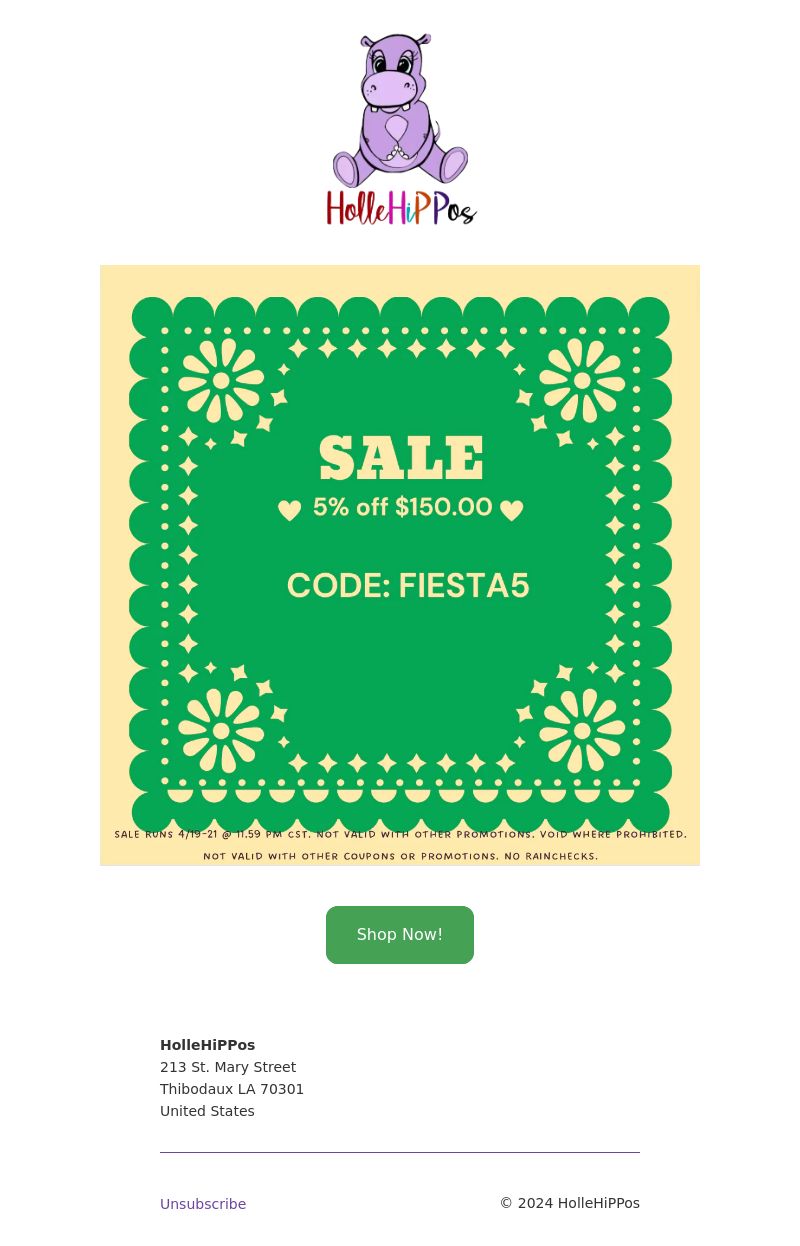
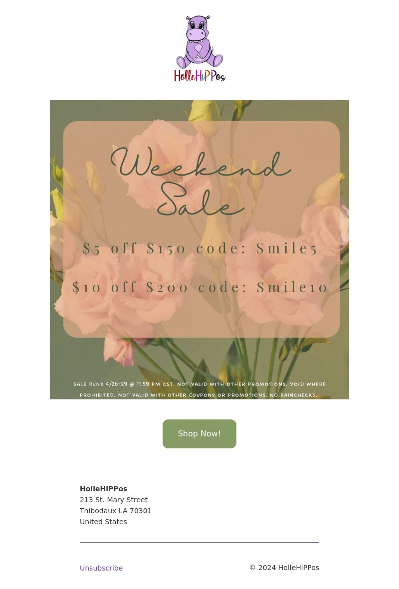
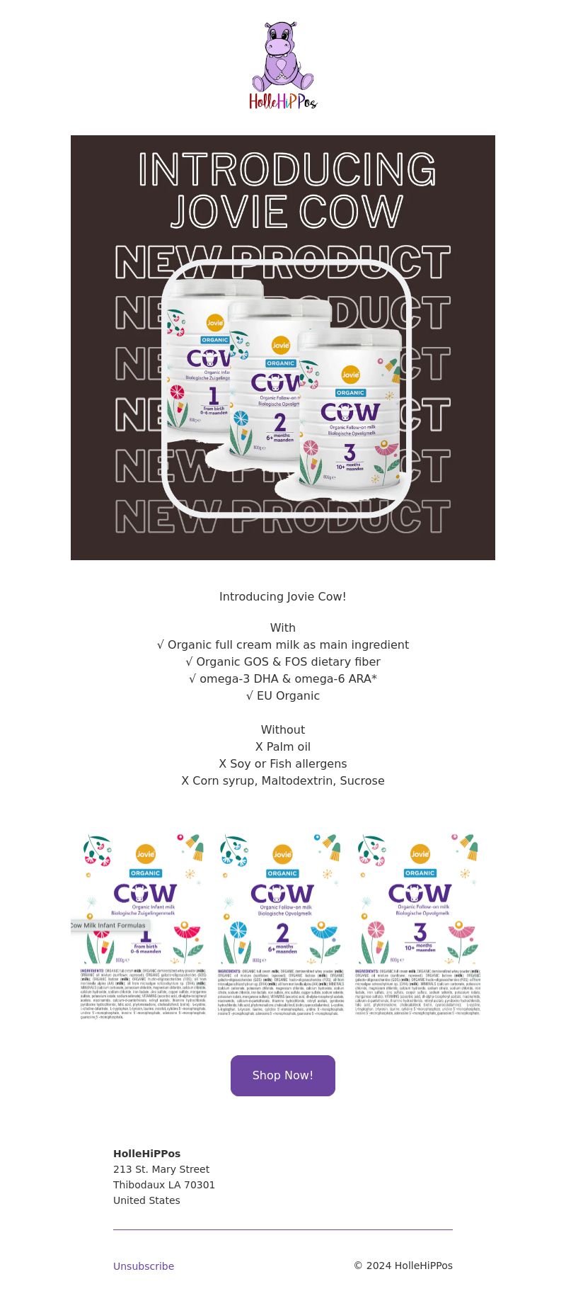
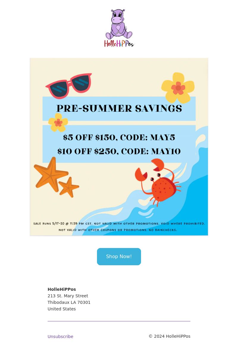
(https://www.hollehippos.eu/_t/c/A1020005-17CDBDBBD23BF1E9-56A541FA?l=AABX5ysD6mm9D%2BGh5hn3e83k%2FWHrRWuAFCLjwn141NI8ZqfjEziN%2BcDHxzqiJ7AyY2mrDS6JuPR3FgM3l9cGGpgI83geaa24Z1A04zcWtMS81AMyOgH62sMpR0MjI7%2BRD3C5XmxGkJw6IvG4Yd7zHVnGy%2FLpweFDDU0gXSETCKsF2fV%2BDfLQOpZtjvVtcVWTqFxblklpBJ3IfE%2Ffvij0IRumTQo2XqcppLJ4DW2YFEnFyeM94ZkX5ulvQQEiURZK7dEYekc%2BbkadHHZbhdfNNepAfLHQAA%3D%3D&c=AAA2ilpbJAjDPiNvMjU8sCf%2FnKUl56%2ByLijK4R5AjKFpvZBkvIixX0JRLDQPb6EB5WRm4wF%2B719QDedIadYXM3%2FlvOGxZje720iK%2B9OVDaau3zS2cOSBP4I6%2F9kd%2Ft3kivQUpu%2Fr86SIas0K%2FtutWC58Pnyfpcn6RkDMNLwEZdKBDYzSukZZUCA98DT7pfzwz6ZRYw%2F%2Fy7%2B0mEnt8glVkC2w%2FGCg9ItjQ6S7Qb7bxbiWoXfQM9n4iCqdAfd5M5xCySuxlFrj3E9JpccoifmIudD0lQw5xY4a%2BubWQrRLCyp7xcA7N1zVZ0zumDVRYnlQdC6j0O74fo8admipluVE9xu%2BhFSso%2B76T%2Fdi1XcisRruaA9LwhMTqwyBXCtVoqvQMCfq88FMxsaS9aQiZxJ00P%2FbJVIsAsSsMKLEK%2FP3g5kyL9UliPcW6XeLGGOAMDM6pVlgumnxn1TJu1dJDL8rnlp3di6KHqK6jWRCbmwuBq6vdXsBhIs6ZNevq1HhOk7nS9AlUnbw6NMvEuTiolq6PrrlRDaVYaAImj47S7WJ%2BB6ST5t9bdRefAn7tfSmDCrqvngEUEFR03Z%2Bner2MKhsEJDBnvOJSSYvswY1HyUh52W5HsRxG%2FZsGdLHQW2gq%2FIm0UoeH2WpFRFFislJdVyYQfYj)
Shop Now! (https://www.hollehippos.eu/_t/c/A1020005-17CDBDBBD23BF1E9-56A541FA?l=AADNGzKRED34pf87AuLXq%2Bh0Cm62rOnA5vpgk2DS8gvU%2BRSKtgImRv6KNkCipd%2FWNwNHa3i7hDnOon7aUTmY59xJnwrnaQNbm%2BQFOblAQQm%2Ft%2B3BR%2FlBsVBhTvnD7lCOw8ApRGlewDDIvNVYw9hszUQjtgb0S0%2F%2BCA%3D%3D&c=AAA2ilpbJAjDPiNvMjU8sCf%2FnKUl56%2ByLijK4R5AjKFpvZBkvIixX0JRLDQPb6EB5WRm4wF%2B719QDedIadYXM3%2FlvOGxZje720iK%2B9OVDaau3zS2cOSBP4I6%2F9kd%2Ft3kivQUpu%2Fr86SIas0K%2FtutWC58Pnyfpcn6RkDMNLwEZdKBDYzSukZZUCA98DT7pfzwz6ZRYw%2F%2Fy7%2B0mEnt8glVkC2w%2FGCg9ItjQ6S7Qb7bxbiWoXfQM9n4iCqdAfd5M5xCySuxlFrj3E9JpccoifmIudD0lQw5xY4a%2BubWQrRLCyp7xcA7N1zVZ0zumDVRYnlQdC6j0O74fo8admipluVE9xu%2BhFSso%2B76T%2Fdi1XcisRruaA9LwhMTqwyBXCtVoqvQMCfq88FMxsaS9aQiZxJ00P%2FbJVIsAsSsMKLEK%2FP3g5kyL9UliPcW6XeLGGOAMDM6pVlgumnxn1TJu1dJDL8rnlp3di6KHqK6jWRCbmwuBq6vdXsBhIs6ZNevq1HhOk7nS9AlUnbw6NMvEuTiolq6PrrlRDaVYaAImj47S7WJ%2BB6ST5t9bdRefAn7tfSmDCrqvngEUEFR03Z%2Bner2MKhsEJDBnvOJSSYvswY1HyUh52W5HsRxG%2FZsGdLHQW2gq%2FIm0UoeH2WpFRFFislJdVyYQfYj)
HolleHiPPos
213 St. Mary Street
Thibodaux LA 70301
United States
Unsubscribe (https://www.hollehippos.eu/account/unsubscribe?token=L5Oe9mYmZi8ia0r5yzUZj37CuvFqG718f6K-XQOPDdZ1-Q7AndoleP2-GoIk9cS-_WGp3rLPYS5dx7eZND-OtkmcvB7xINUyGMLLx6BTYrw%3D&utm_campaign=emailmarketing_151896031452&utm_source=shopify_email&utm_medium=email&utm_content=unsubscribe_batch_5c3c5c46-c186-4e30-a787-0bae09e990fd)
© 2024 HolleHiPPos